most of my time at work i spend standing up in front of screens
some of my work is in classrooms
and little bits here and there are in meeting rooms across campus
when im working in any of the above ways, i visualize what is being talked about in my head and try to shape/re-shape the things being talked about
these following images are the most common ones that swirl in my head as i work(they are all stolen and/or adapted from other sources as noted):
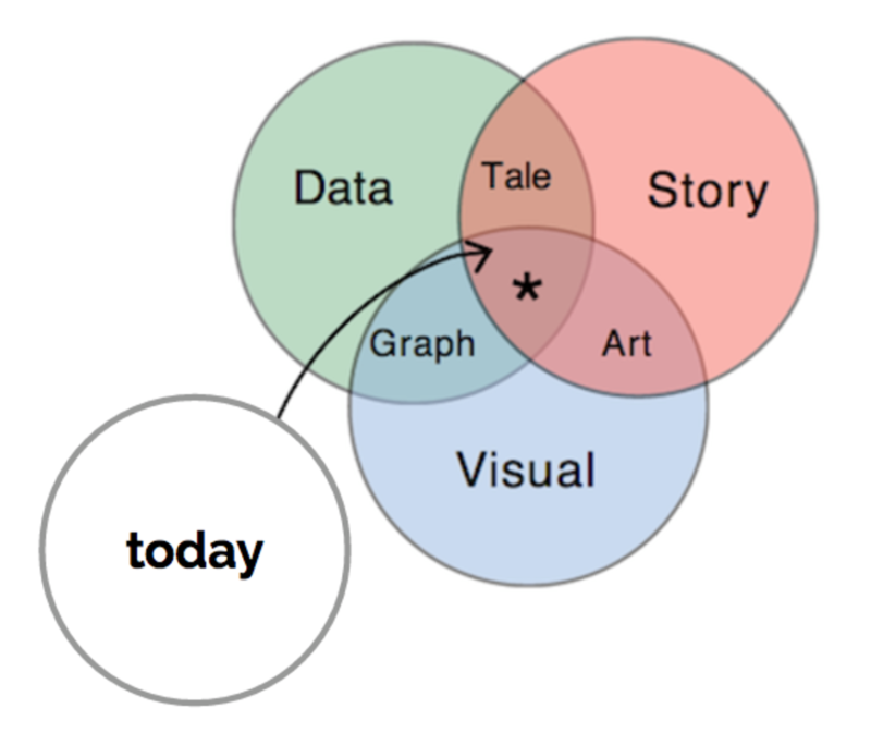
this one is what i aspire to do most of the time – find connections between peoples’ narratives/data/”images” and try to leave the space with some sort of take away – try to hit that center asterix even if in a “small way”
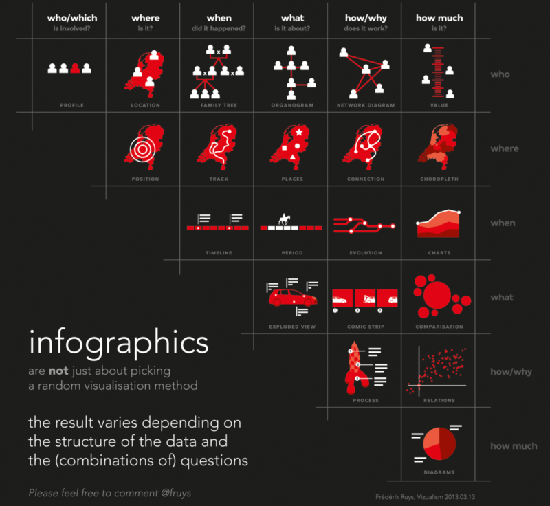
this is a relatively “new to me” grid that i think helps figure where/when what images/approaches can be used and what questions should be asked – it helps as a starting point and is pseudo easy to explain
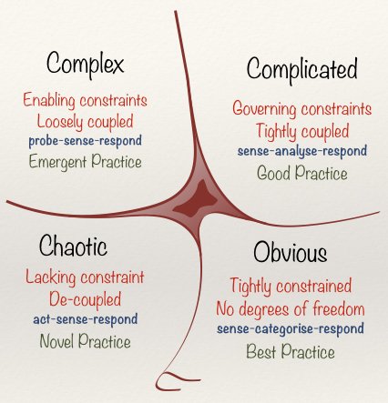
this is the CYNEFIN FRAMEWORK – i learned about it several years ago and have used it frequently when working with, well, pretty much everyone. its a great way to structure talks and approaches around ideas. it can take some complex relationships and make them easier to talk about.
these last two images are visitor and resident maps (#vandr). all you kind of need to know about this is HERE. i have used this exercise in countless classes, workshops, and consults. it is a great way to get people to feel on the same page and to help unpack some of the “digital dualist” notions that circulate. the colour image above is a map i did a long time ago, while the black and white one i did this week as part of the #DdigPINS class.
although these aren’t all of the approaches i use, they do capture some strong pieces that i have found of value when dealing with the variety of peeps in several types of #highered milieu.

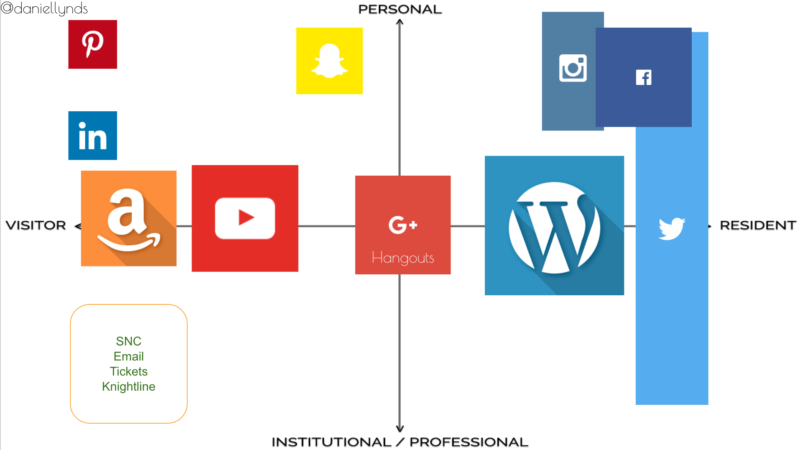
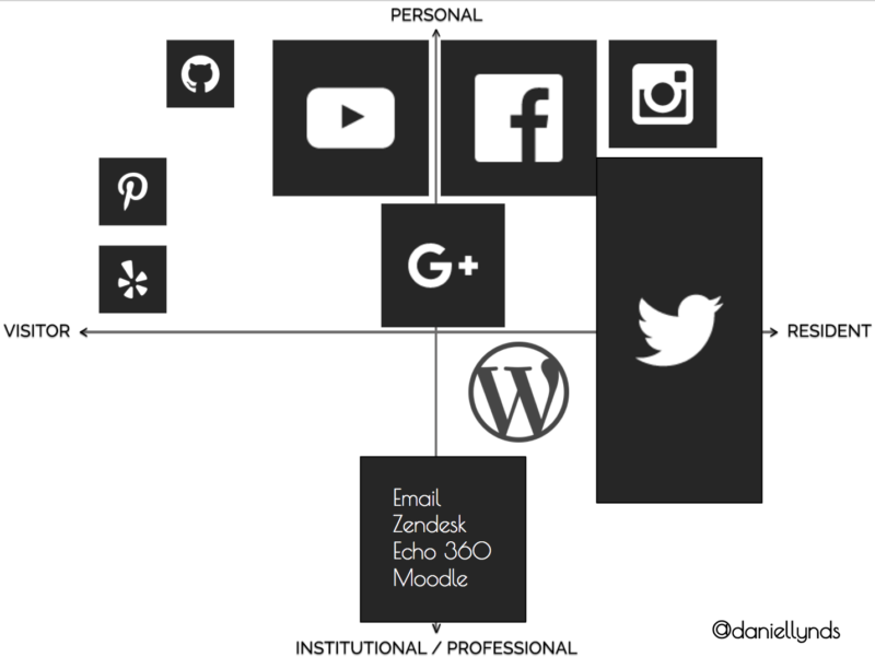
I’m curious about why Facebook has floated so far into the personal sphere since the previous map. Also, what has changed about email and why you consider your institutional toolkit (email and such) further towards resident? Is this because your understanding of visitor / resident has changed or that your practices have changed?
I hadn’t seen the infographics chart. That is a great share, thanks!
[…] off down the line. My main goal when working with people is to amplify their work in the open. When I first meet people I use a variety of frameworks to begin our work together. Using these frameworks, I try to get as much of the work into the open and in my first 33 days […]